Joining Meta marked a significant milestone — it was the first role where I led both the design and the coding for every initiative I worked on. Having spent two years prior deeply immersed in vibecoding to build and ship independent products, I brought a hybrid approach to Meta. I didn't just design interfaces; I built the functional applications that brought those designs to life for thousands of employees.
At Meta, my work spans internal tools and platforms focused on improving employee experience and developer productivity. Below are the key projects I have led. As I continue to build and ship at Meta, this page will grow — each new project documented and added here.
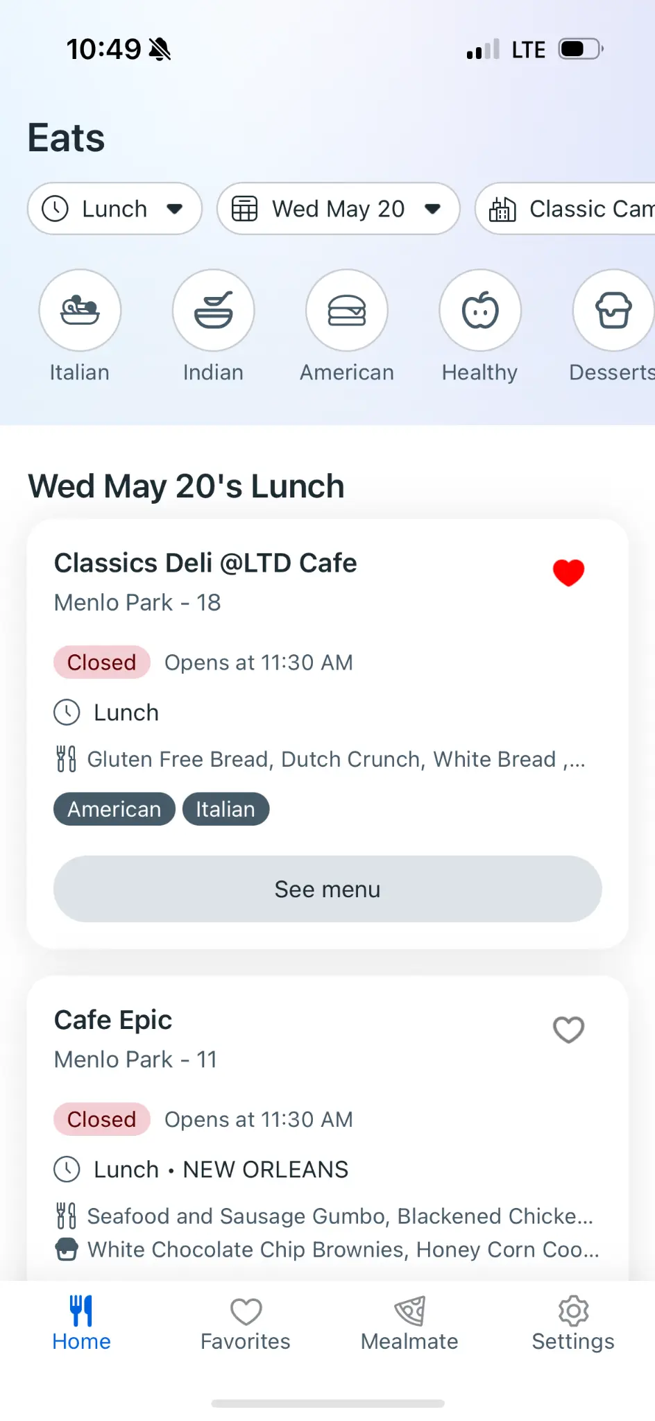
Campus Eats: Mobile Dining Experience for Enterprise
A case study in platform strategy, technical execution, and enterprise product consolidation
Campus Eats is a mobile dining application designed to streamline the meal ordering experience for employees across enterprise campuses. As part of a broader Workspace Campus product ecosystem, the project aimed to modernize legacy dining systems while establishing a strategic framework for future mobile-to-web application consolidations.
The product designer served as both design lead and hands-on technical contributor, working at the intersection of user experience and production-level code. This dual capacity enabled rapid prototyping, direct implementation of design decisions, and close collaboration with engineering leadership on platform architecture choices.
The project scope evolved from a standalone React Native mobile application to a potential proof-of-concept for enterprise-wide platform consolidation—demonstrating how dedicated mobile apps could transition to mobile-responsive web applications built on modern frameworks.
Challenge
Enterprise organizations often accumulate technical debt through years of building separate applications for different platforms. Each dedicated mobile app requires its own codebase, maintenance cycles, and specialized development resources. For large-scale operations, this fragmentation creates significant inefficiencies.
The Campus Eats project faced three interconnected challenges:
Legacy System Modernization Existing dining systems were built on aging technology stacks, limiting feature development and creating inconsistent user experiences across touchpoints. Employees needed a unified way to browse menus, customize orders based on dietary preferences, and interact with campus dining services.
Platform Fragmentation The organization maintained separate codebases for mobile and web applications, resulting in duplicated effort and inconsistent feature parity. Leadership sought to understand whether dedicated mobile apps could be replaced with mobile-responsive web applications without sacrificing user experience.
Strategic Uncertainty The team needed to deliver immediate value through the mobile app while simultaneously exploring whether their work could serve as a template for broader organizational change. This required balancing short-term execution with long-term platform thinking.
Design Strategy
The design approach centered on creating a flexible foundation that could adapt to evolving platform decisions while delivering immediate user value.
User-Centered Feature Prioritization Research identified core user needs: quick menu browsing, dietary preference management, and reduced decision fatigue during busy workdays. The designer prioritized features that addressed these needs while remaining platform-agnostic in their implementation logic.
A key feature exploration involved "Chow Roulette"—a randomized dining recommendation engine that helps employees discover new options based on their preferences. The designer investigated integrating this existing internal tool, recognizing its potential to reduce decision fatigue while increasing engagement with underutilized dining venues.
Responsive Design Framework Understanding the potential transition from dedicated mobile app to responsive web, the designer established a component system that prioritized flexibility. Interface elements were designed with breakpoint adaptability in mind, ensuring that visual patterns and interaction models could translate across form factors.
This forward-thinking approach meant that design work completed for the React Native application could inform—and in many cases directly translate to—the mobile-responsive web implementation.
Progressive Enhancement Philosophy Rather than designing for a single platform and retrofitting, the designer adopted a progressive enhancement mindset. Core functionality was designed to work across contexts, with platform-specific enhancements layered on top. This philosophy aligned design decisions with the organization's broader consolidation goals.
Technical Implementation
The designer's production-level coding capabilities enabled direct contribution to the technical implementation, bridging the gap between design intent and shipped product.
React Native Foundation The initial build utilized React Native, leveraging existing mobile app infrastructure and codebase. This allowed for rapid development while maintaining native-feeling interactions on mobile devices. The designer contributed directly to the codebase, implementing UI components and ensuring design fidelity through code.
Framework Transition Exploration As strategic discussions evolved, the team explored transitioning the application to a Nest-based web framework. This modern stack offered advantages for consolidation: a single codebase could serve both desktop and mobile users through responsive design, reducing long-term maintenance burden.
The designer prototyped key flows in both environments, documenting the trade-offs between dedicated mobile apps and responsive web applications. This hands-on technical exploration provided concrete evidence for leadership decision-making.
Code Review Integration To ensure alignment with platform engineering standards and facilitate knowledge sharing, the designer established a workflow that included engineering leadership as reviewers on code submissions. This practice strengthened cross-functional relationships while maintaining code quality.
Product Decisions
Dual-Track Development Rather than committing entirely to one platform approach, the team pursued dual-track development—continuing to enhance the React Native app while building out the mobile-responsive web version. This strategy allowed for direct comparison and provided leadership with tangible options rather than theoretical proposals.
The designer prepared to present both versions to leadership, enabling a data-informed decision about the organization's mobile strategy.
Feature Integration Assessment The Chow Roulette integration required careful evaluation. The designer assessed the existing feature's technical architecture, determining whether the current version could be integrated or whether dependencies on an in-progress version two would create timeline risks. This analysis informed realistic scope commitments.
Consolidation as Case Study The team positioned Campus Eats as a deliberate case study for future mobile app consolidations. Success metrics were designed not only around user satisfaction and adoption but also around the replicability of the approach for other enterprise applications—including the identified high-priority Wayfinder navigation app.
Cross-Functional Collaboration
Engineering Partnership Close collaboration with the Campus team—responsible for employee-facing products—ensured alignment on technical direction. Regular syncs with engineering leadership provided visibility into platform decisions while enabling the designer to advocate for user experience considerations in technical discussions.
Leadership Alignment The platform consolidation question required input from multiple leadership levels. The designer worked with their manager to structure the decision-making process, preparing materials that clearly articulated trade-offs and recommendations while leaving strategic direction to appropriate decision-makers.
Community Contribution Model The Chow Roulette feature exemplified a community-driven development model, with engineers contributing to modernization efforts alongside their primary responsibilities. Understanding this dynamic helped the designer navigate dependencies and set realistic integration timelines.
Strategic Impact
Immediate User Value The application provided employees with a modernized dining experience: streamlined ordering, personalized recommendations, and dietary preference management. These improvements directly addressed user pain points identified through research.
Platform Strategy Clarity By executing both mobile app and responsive web versions, the project generated concrete evidence for platform decisions. Leadership gained visibility into the real-world trade-offs between dedicated apps and consolidated web applications, informing strategy beyond the dining vertical.
Replicable Framework The project established patterns—both design and technical—that could be applied to future consolidation efforts. The identified Wayfinder app represented a clear candidate for similar treatment, with the Campus Eats experience providing a template for approach.
Organizational Efficiency The consolidation exploration directly addressed maintenance overhead from platform fragmentation. By demonstrating that responsive web applications could deliver comparable experiences to dedicated mobile apps, the project supported long-term efficiency gains.
Lessons Learned
Design for Ambiguity Enterprise product work often involves evolving requirements and strategic uncertainty. Designing flexible foundations—rather than optimizing for a single assumed direction—enabled the project to adapt as organizational priorities clarified.
Technical Fluency Accelerates Decisions The designer's ability to implement and prototype in production code shortened feedback loops and generated higher-fidelity evidence for strategic decisions. This capability proved particularly valuable when comparing platform approaches.
Platform Thinking Extends Impact Framing individual projects within broader platform context multiplies their organizational value. Campus Eats delivered user value while simultaneously informing enterprise-wide technology strategy—an outcome enabled by intentional positioning from project inception.
Stakeholder Alignment Requires Structure Complex decisions involving multiple leadership levels benefit from structured decision-making processes. Preparing clear options with articulated trade-offs enabled efficient leadership input without bottlenecking project progress.
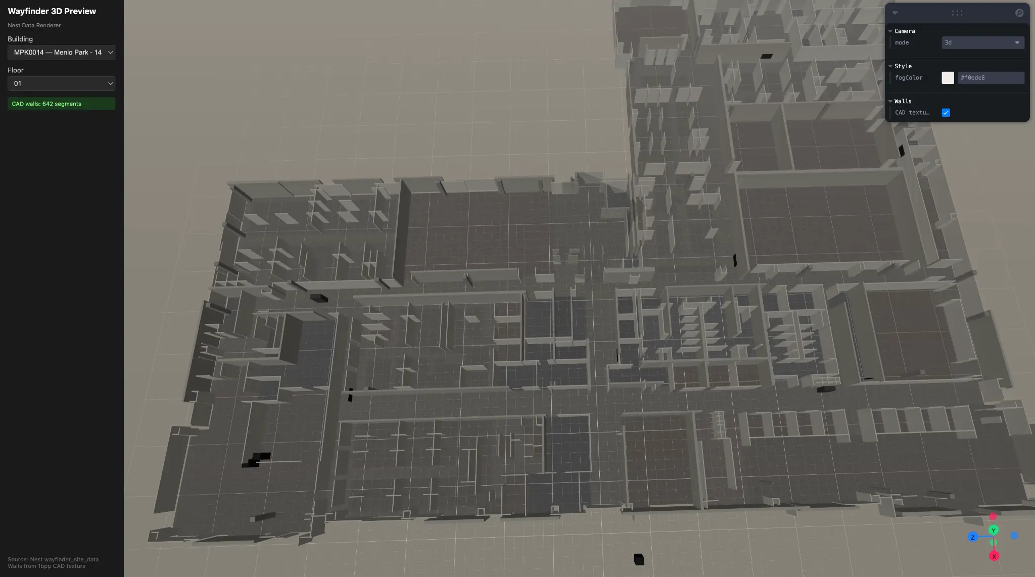
Raw CAD geometry extracted from DXF — 642 wall segments, MPK14 Floor 01
Overview
Wayfinder Nextgen represents a comprehensive redesign and re-architecture of Meta's internal indoor navigation platform—a critical piece of workplace infrastructure serving tens of thousands of employees across global campuses. The product enables employees to navigate sprawling multi-building complexes, locate meeting rooms, check real-time availability, reserve desks, and request physical access to secured spaces.
Hani David Kharufeh joined the Workplace Experiences team as a Product Designer with production-level engineering capabilities, tasked with transforming an aging, CAD-based navigation system into a modern, performant, and extensible platform. The project demanded equal parts design vision and systems architecture—requiring someone who could not only define the user experience but also implement the technical foundations to support it.
Over the course of several months, Hani led the architectural vision, authored over 7,000 lines of production code across 30+ files, established industry-grounded design principles, and shipped critical UX improvements—all while navigating tight deadlines and validating ambitious new concepts with design leadership.
Early-stage 3D geometry extraction from parsed DXF data
The Challenge
The existing Wayfinder implementation suffered from compounding technical debt that directly impacted user experience. Initial discovery revealed several critical pain points:
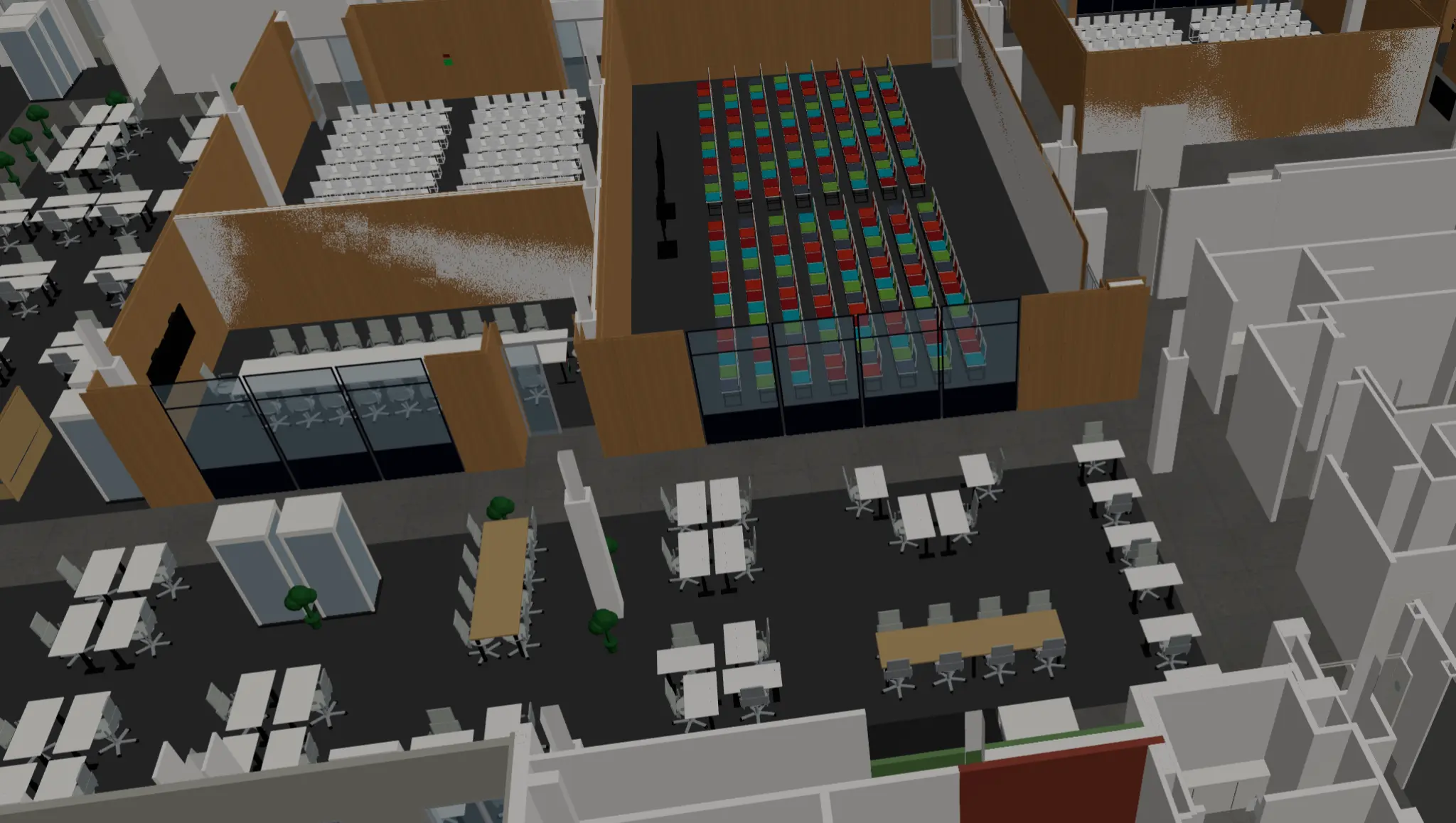
Visual Clutter and Information Hierarchy Failures. The legacy interface rendered raw CAD files directly, resulting in maps cluttered with architectural details irrelevant to navigation—structural columns, window mullions, HVAC annotations. Users struggled to quickly identify their destination amidst the visual noise.
Fragmented Rendering Architecture. The codebase maintained two parallel rendering pipelines: an orthographic 2D renderer and a perspective 3D renderer. Despite both using Three.js as a backend, they shared no scene graph, data model, or camera system. This duplication created maintenance burden and inconsistent behavior between views.
Severe Performance Constraints. Technical analysis revealed the Three.js pipeline generated approximately 1,000 draw calls per floor—5 to 10 times above acceptable mobile performance budgets. This resulted in sluggish interactions, particularly on lower-powered devices common in conference room kiosks.
Resource Management Failures. The system lacked any asset pipeline or GPU resource lifecycle management. Every floor switch leaked GPU memory, causing progressive degradation during extended sessions—a critical failure for kiosk deployments expected to run continuously.
Data Model Inconsistencies. Room type classification existed in three separate files with three incompatible taxonomies. This fragmentation caused bugs where a room might appear as "Conference Room" in one view and "Focus Space" in another.
Aggressive Timeline. The team faced a hard deadline to complete the web version migration by end of May, requiring rapid prioritization and strategic technical investment.
Discovery & Research
Stakeholder Alignment The designer initiated the project through structured discovery with key stakeholders. In conversations with the Product Manager, Hani mapped the full feature surface—interactive maps, desk reservations, co-working space discovery, and physical access requests—while identifying the PM's priorities around visual styling improvements and information hierarchy.
A subsequent validation session with the Design Director proved pivotal. When presenting an ambitious 3D point-of-view navigation concept, leadership challenged the fundamental value proposition: "It looks cool is not a sufficient reason." The director emphasized that 3D perspective views could actually obscure wayfinding by hiding bathrooms, landmarks, and room labels behind walls. This feedback critically shaped the strategy—the designer preserved the 3D capability behind feature toggles while prioritizing the proven 2D experience for core navigation tasks.
Industry Reference Analysis To establish an ideal architectural target, Hani conducted deep analysis of industry-leading mapping frameworks:
Mapbox GL / MapLibre demonstrated tile-based pipeline excellence—data fetched, parsed, and tessellated on web workers, with the main thread never touching raw geometry. The style-driven rendering model proved particularly influential, where declarative specifications drive layer ordering without imperative code.
Three.js / React Three Fiber (R3F) revealed the power of mapping scene graphs to component trees. R3F's reconciler-based approach eliminates manual lifecycle management—a direct solution to Wayfinder's memory leak problems.
deck.gl showcased the layer-as-pipeline pattern, where each layer owns the entire path from JavaScript object to pixel. The AttributeManager's incremental update strategy—only re-uploading changed data columns—offered a template for performance optimization.
CesiumJS proved that multi-projection rendering need not require duplicate pipelines. A single SceneMode enum switches between 3D, 2D, and 2.5D views, with all primitives adapting through a uniform projection interface.
Technical Audit Hani executed a comprehensive architectural review spanning approximately 7,125 lines across 30 files. This analysis, structured across three tracks and synthesized into a formal design review document, identified the MapInterface contract as the strongest existing architectural asset—featuring well-designed branded types, discriminated unions, and clean separation of concerns. This contract became the foundation for the new architecture.
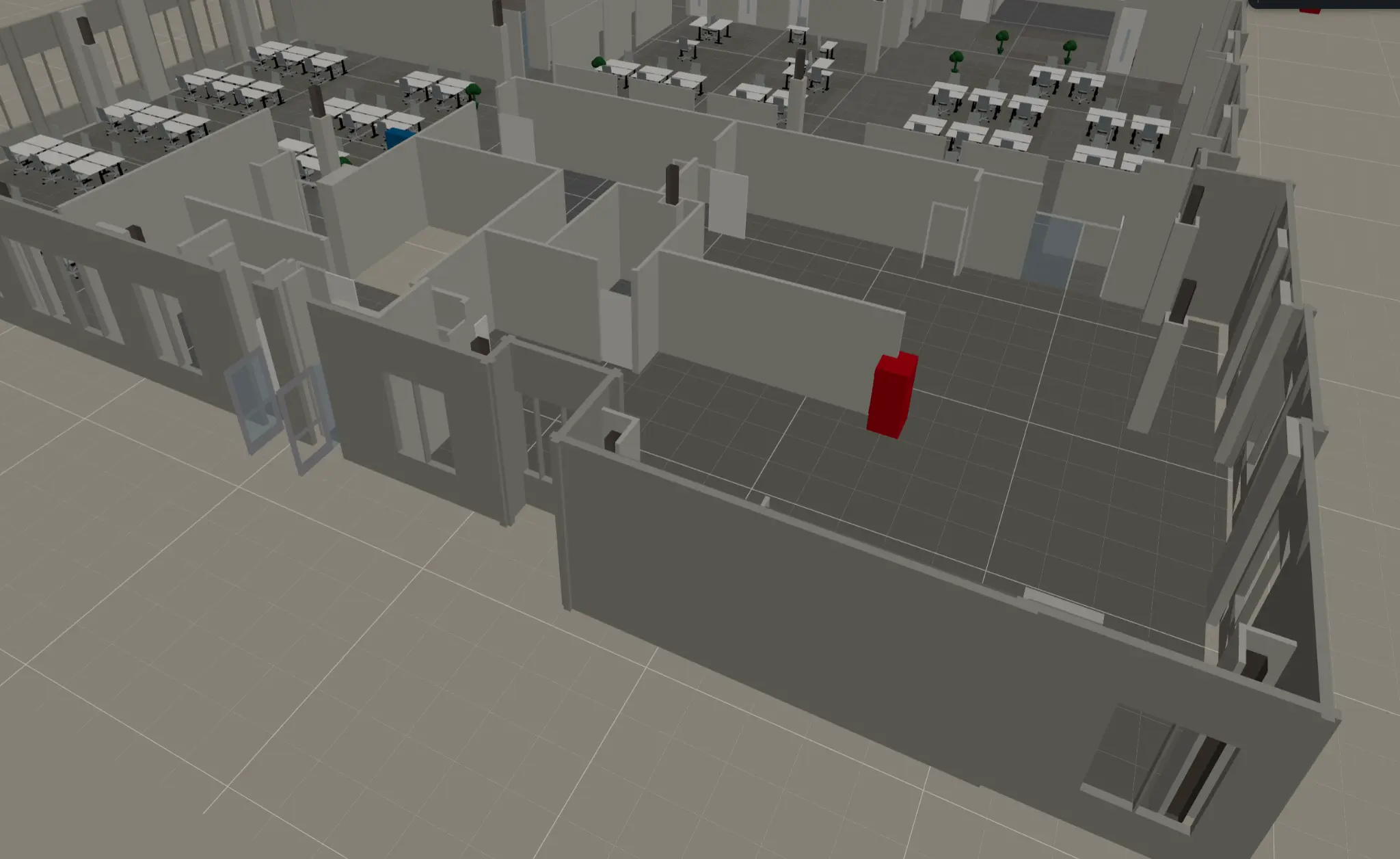
Textured 3D render — furniture, brown walls, and colored seating areas parsed from the CAD pipeline
Design Strategy
The Ten Principles From industry analysis and technical audit emerged ten non-negotiable design principles that would govern all architectural decisions:
One canonical world model, many cameras — Eliminate duplicate scene graphs
Separate semantic data from render data — Domain logic must not leak into GPU code
Use a retained-mode layer architecture — Move away from immediate-mode drawing
Prefer a hybrid model — Neither pure scene graph nor pure ECS, but pragmatic combination
Make the frame pipeline explicit — Clear render loop phases enable optimization
Build for async and partial readiness from day one — Progressive loading is not optional
Treat input as its own subsystem — Gesture handling requires dedicated architecture
GPU and memory budgets are product features — Performance constraints shape design
Plugin boundaries at the semantic level first — Extensibility through domain concepts
The core must be framework-agnostic — React binding, not React dependency
These principles served as evaluation criteria for every subsequent technical and design decision.
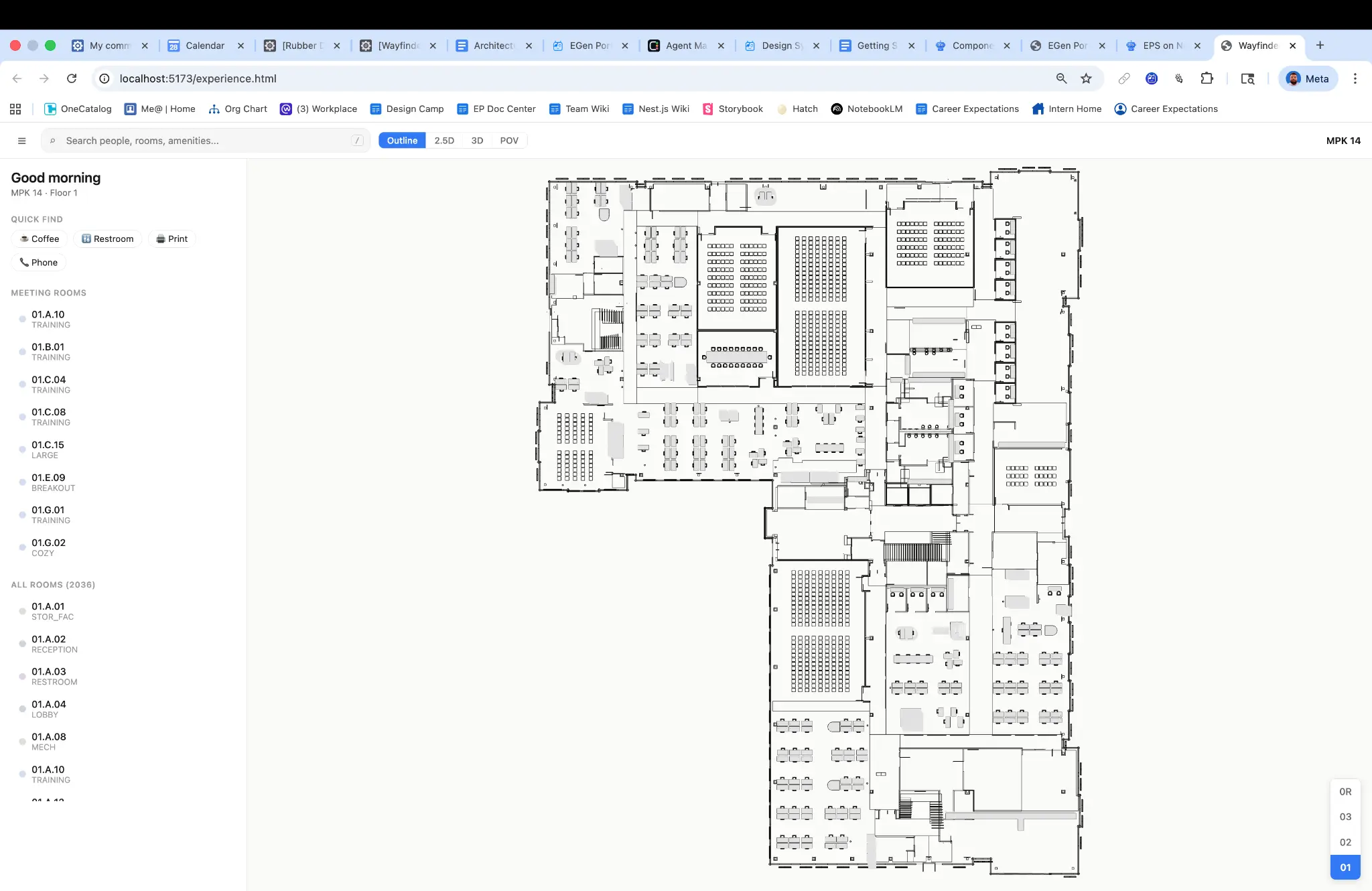
Clean 2D outline view — MPK14, Floor 1
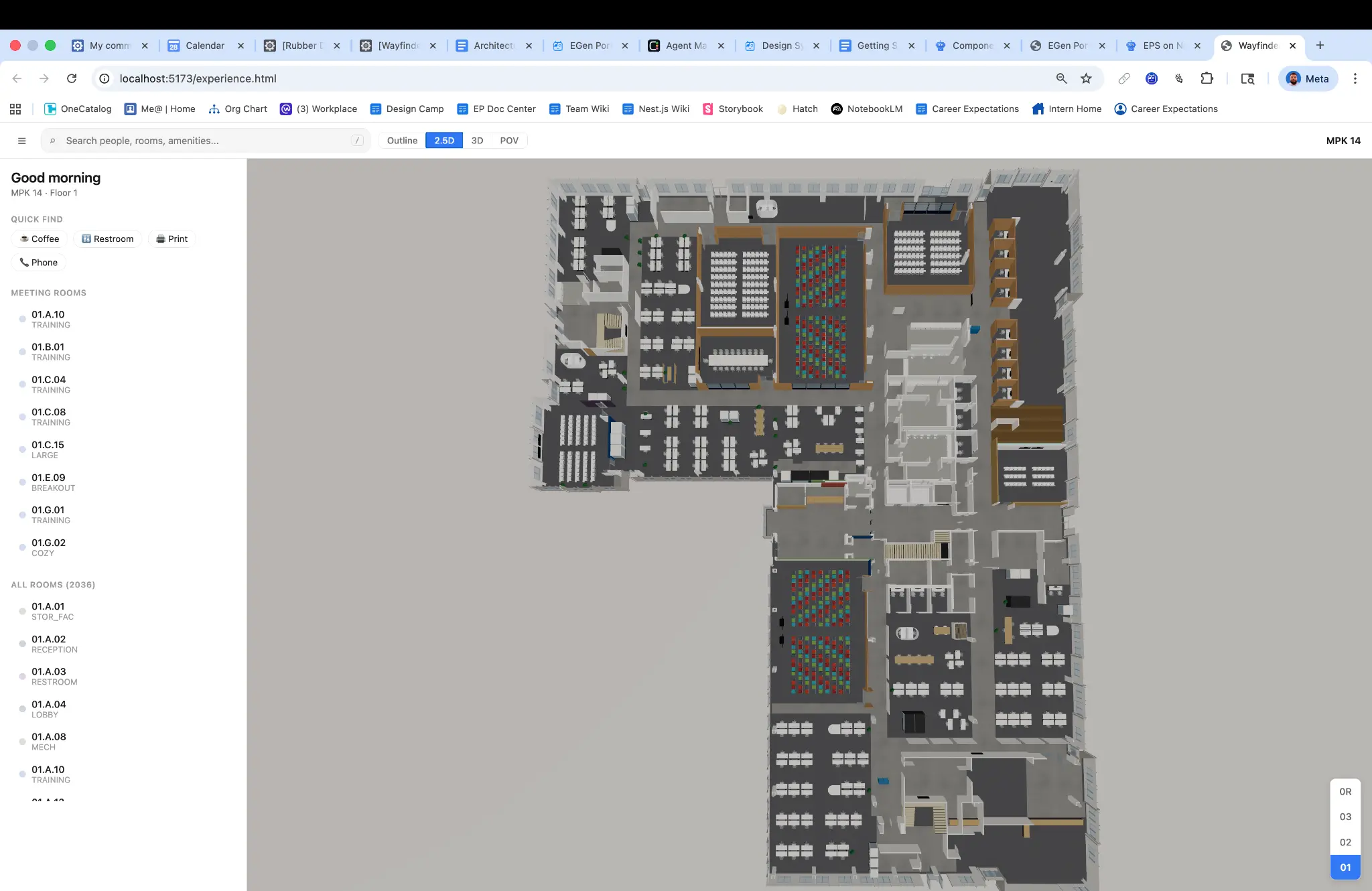
2.5D view with room list — same floor, different perspective mode
Technical Architecture
The Four Planes Model The designer established a horizontal architecture organized into four distinct planes, each with clear responsibilities and narrow interfaces to adjacent planes:
Domain Plane owns the canonical representation of indoor map entities—buildings, floors, rooms, paths, and points of interest. It provides spatial queries (point-in-room, nearest-neighbor) and coordinate transforms while knowing nothing about rendering. Core abstractions include branded ID types (BuildingId, FloorId, RoomId) ensuring compile-time type safety, a SpatialIndex interface for efficient geometric queries, and a GeoTransform interface bridging local coordinates with geographic and screen space.
View-Model Plane bridges data and pixels. It consumes domain data and camera parameters to produce renderable descriptions—visible layers, evaluated style properties, active animation interpolations. This plane owns camera state across the 2D, 3D, and POV modes advertised in the interface contract.
Render Plane owns the GPU. It compiles view-model output into draw calls, manages buffer and texture lifetimes, and submits command queues. Critically, it is backend-specific—designed to support WebGL2 today and WebGPU tomorrow without affecting upper planes.
Interaction Plane captures raw DOM events, normalizes them into semantic gestures (pan, pinch, tap, hover), performs hit testing via the render plane's picking mechanism, and dispatches commands back to domain and view-model planes.
Key Design Decisions
Unifying the Rendering Pipeline The most consequential architectural decision was rejecting the dual-pipeline status quo. Rather than maintaining separate 2D and 3D renderers, the new architecture implements a single scene graph with camera-mode abstraction—directly inspired by CesiumJS's SceneMode pattern. Orthographic and perspective views become camera configurations, not separate implementations. This eliminated code duplication, ensured behavioral consistency, and created a foundation for the POV navigation mode leadership wanted to explore.
Worker-Based Geometry Compilation To address the 1,000+ draw call performance problem, Hani implemented a GeometryCompiler that offloads tessellation and buffer preparation to Web Workers. Following the Mapbox GL pattern, the main thread never touches raw geometry—it receives pre-built typed arrays ready for GPU upload. This architectural shift was essential to meeting mobile performance budgets.
GPU Picking Over Raycasting For spatial interaction, the designer adopted deck.gl's color-encoded picking strategy: render each object with a unique color into an offscreen framebuffer, read the pixel under the cursor to determine object ID. This approach works uniformly across all geometry types, scales better than CPU raycasting as scene complexity increases, and naturally integrates with the GPU pipeline.
Toggle-Protected Innovation Responding to leadership feedback about 3D value proposition uncertainty, Hani implemented 3D features as toggled capabilities that could be enabled, disabled, or progressively revealed. This protected the implementation investment while allowing product decisions to be made through user research rather than architecture constraints.
Implementation
Hani authored production code across six stacked diffs, establishing both architectural foundations and shipping user-facing improvements:
MapInterface Contract & Scaffold — The foundation diff established the type contract with branded IDs, discriminated unions, and configuration schemas, followed by the createNestMapImpl implementation scaffold integrating with the existing codebase.
GeometryCompiler with Web Worker Support — Core rendering performance infrastructure enabling main-thread isolation from geometry processing.
GPU Picking and Coordinate Transforms — Interaction layer implementation providing efficient hit testing and coordinate space conversion.
Comprehensive Test Infrastructure — Unit tests covering the camera system, spatial index operations, and site data parser—ensuring architectural integrity as the system evolved.
Critical UX Improvements — Unified search consolidating previously fragmented discovery flows, redesigned side panel improving information hierarchy, intelligent room grouping reducing visual clutter, and floor synchronization ensuring consistent state across views.
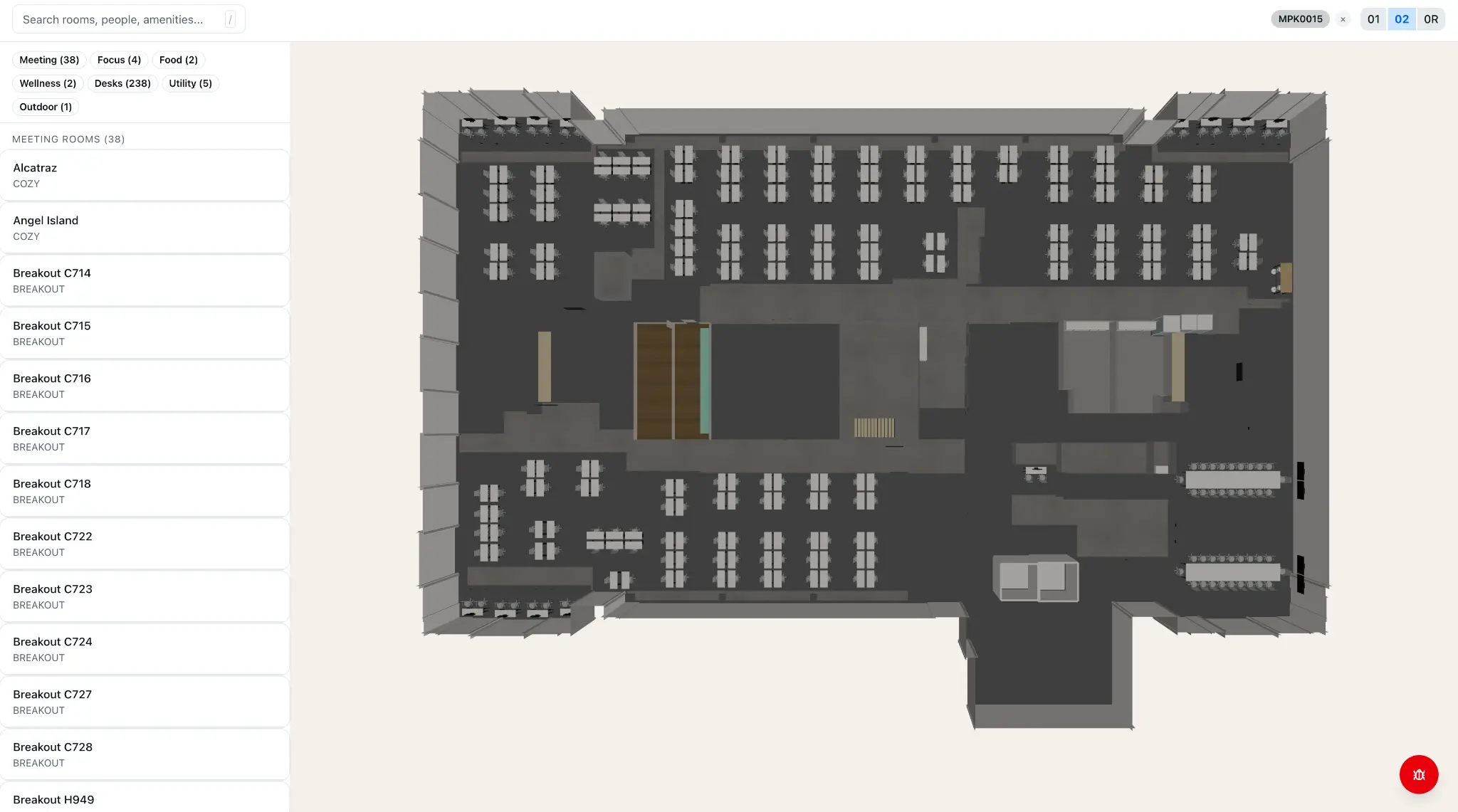
Full Menlo Park campus rendered in 3D — the culmination of the CAD-to-schema pipeline
Impact & Outcomes
Architectural Clarity. The comprehensive design review document and four-planes architecture provided the team a shared mental model and clear migration path: six phases over 10–13 weeks to reach the ideal architecture.
Performance Roadmap. By establishing explicit GPU and memory budgets as product features—not afterthoughts—the team could make principled tradeoffs between visual richness and device support.
Preserved Optionality. The toggle-protected 3D implementation allowed the product to ship stable 2D navigation immediately while retaining the ability to progressively enable 3D features as user research validated their value.
Scalable Schema. Testing the interior schema against diverse building configurations validated that one comprehensive map approach could extend across entire campuses rather than requiring per-building customization.
Foundation for Migration. The MapInterface contract and modular architecture enabled incremental migration from the legacy renderer without requiring a risky full rewrite—each plane could be upgraded independently.
Lessons Learned
Principles as Decision Framework. The ten design principles transformed from abstract ideals to practical evaluation tools. When facing implementation choices, the team could ask: "Does this respect the one-world-model principle? Does this make frame pipeline explicit?" This shared vocabulary accelerated decisions and reduced debate.
Challenge Assumptions Early. The design leadership meeting that questioned 3D value wasn't a setback—it was a gift. Early validation prevented over-investment in capabilities that might not serve core user needs, while the toggle architecture preserved the ability to revisit the decision with data.
Technical Debt is Design Debt. The triplicated room taxonomies, memory leaks, and performance problems weren't merely engineering issues—they manifested as UX failures: inconsistent labels, degraded responsiveness, unreliable interactions. Addressing architecture was addressing experience.
Industry Patterns Transfer. Studying Mapbox GL, deck.gl, and CesiumJS didn't just inform architecture—it provided validated solutions to specific problems. The color-encoded picking, worker-based compilation, and SceneMode patterns were proven at massive scale before being adapted for Wayfinder.
Design-Engineering Integration Multiplies Impact. A designer who can author production architecture doesn't just hand off specifications—they can ensure design intent survives implementation, identify technical constraints that shape UX possibilities, and build the foundations that enable future design iteration.
This case study represents work completed while at Meta on the Workplace Experiences team. Proprietary details have been generalized to protect confidential information while preserving the authentic design and engineering process.
Rubber Duck: Full Diff Lifecycle Management & Autonomous Stack Babysitter
Impact: Transformed a 48-hour hackathon prototype into a production-grade developer tool with multi-platform distribution
Overview
Rubber Duck is an AI-powered developer tool that manages the complete lifecycle of code changes—from pre-submission validation through automated landing. What began as a scrappy hackathon project called "Diff Daemon" evolved into a comprehensive platform serving engineers across a 70,000+ person organization.
The designer led the end-to-end product vision: defining interaction models, designing the autonomy framework, establishing safety architecture, building the technical implementation, and shepherding community adoption. This case study documents the journey from initial insight to shipped product.
The Challenge: The "4-Day Babysitting Cycle"
Modern software development at scale involves a deceptively time-consuming process: shepherding code changes through review, continuous integration, and landing. At large technology companies, a single code change might require:
Pre-submission: Running 6–8 different validation tools across multiple environments
CI monitoring: Watching for test failures, distinguishing real failures from infrastructure flakiness
Review iteration: Responding to feedback, re-running checks, updating documentation
For engineers working on "stacked" changes—where multiple dependent code changes build upon each other—this overhead compounds dramatically. A stack of five changes might require dozens of manual interventions over several days.
Discovery Research
Through contextual observation and developer interviews, the designer identified three critical pain points:
Context switching cost: Engineers reported checking CI status 15–20 times per day, fragmenting deep work
Tribal knowledge barriers: Knowing which failures were "real" versus flaky required institutional knowledge that newer engineers lacked
Overnight stalls: Code changes approved at 5 PM wouldn't land until the engineer returned the next morning to babysit them through
The hypothesis emerged: What if a tool could understand where a code change sits in its lifecycle and take contextually appropriate action—or at minimum, surface the right information at the right time?
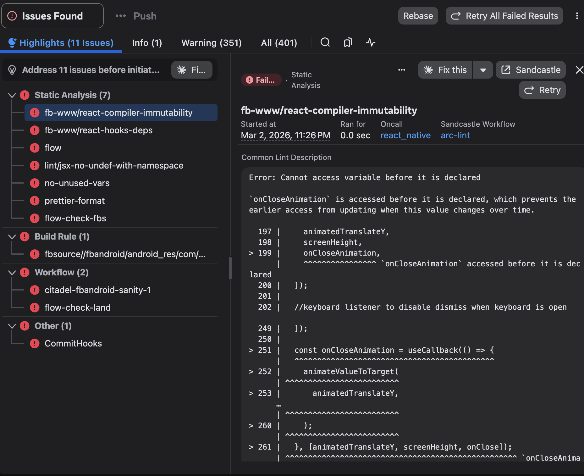
The problem in practice — 11 CI issues blocking submission, spanning static analysis, build rules, and workflow checks
Origin Story: From Hackathon to Product
During a company-wide hackathon, the designer built "Diff Daemon"—a command-line tool that could accept any code change identifier, automatically detect its current lifecycle phase, and display a contextual dashboard with relevant actions. The prototype was intentionally minimal: a single command that returned a status table. But it validated the core insight—engineers didn't want another monitoring dashboard to check. They wanted a tool smart enough to tell them what mattered right now.
The hackathon demo generated unexpected enthusiasm. Engineers asked: "Can it also fix the lint errors?" "Can it retrigger the flaky test automatically?" "Can it just... handle the whole thing?" These questions reframed the product direction entirely.
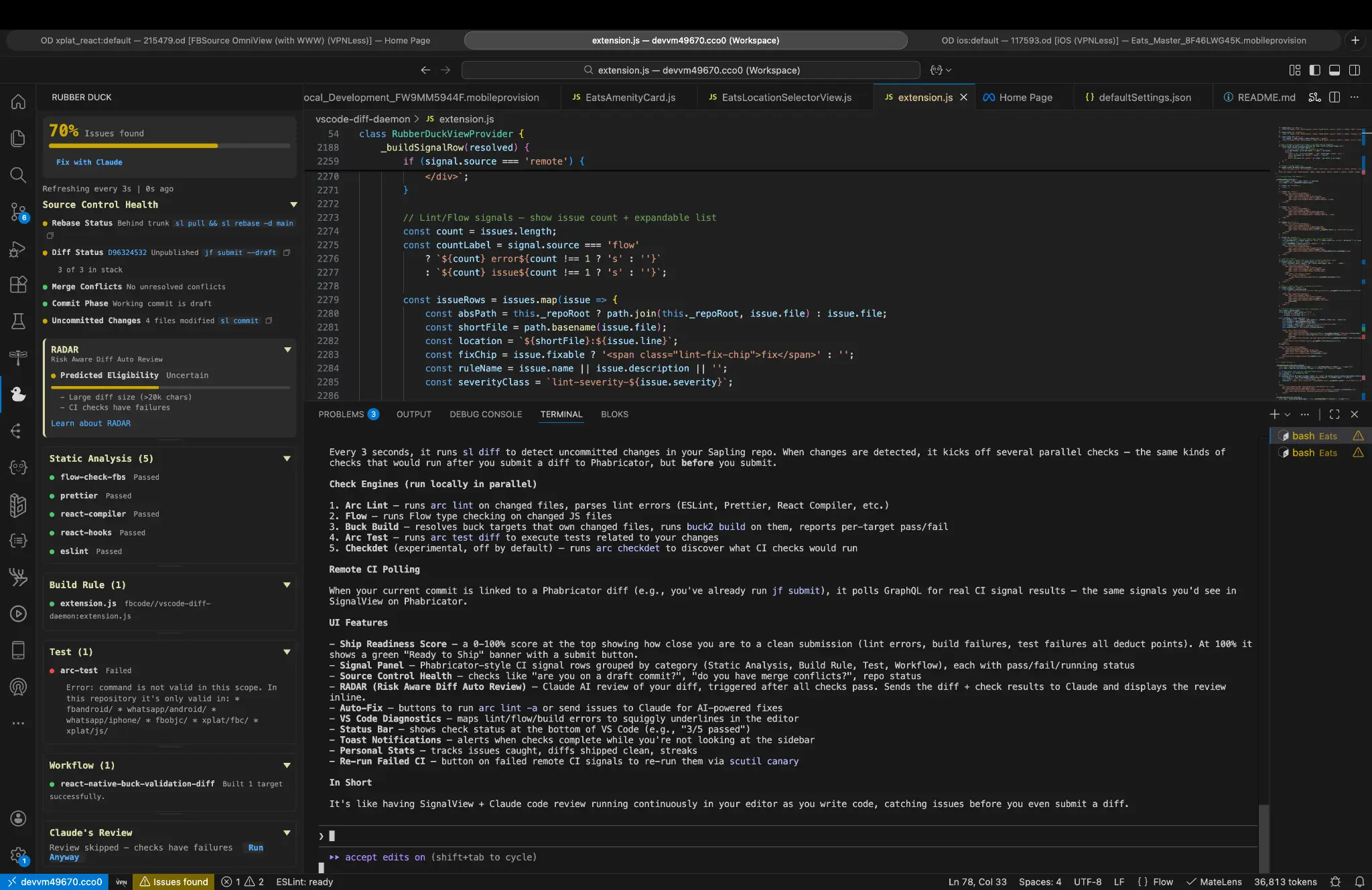
Rubber Duck in the IDE — Ship Score at 70%, CI signal panel, RADAR AI review, and source control health all surfaced in one sidebar
Design Strategy
Dual-Mode Architecture The designer developed two complementary interaction modes:
Reactive Mode functions as an intelligent assistant. Point it at any code change and it auto-detects the lifecycle phase, surfacing a contextual dashboard with pre-submission validation status, CI monitoring with failure classification, review feedback summary, landing readiness assessment, and multi-change stack visualization.
Babysit Mode functions as an autonomous agent. Run it in a continuous loop and it actively manages an entire stack of changes: walks the stack from bottom to top (respecting dependency order), auto-fixes formatting and lint violations, retriggers tests classified as flaky, publishes changes as their parent dependencies go green, auto-resolves trivial review comments (labeled as "nits"), runs production canaries at intervals, and reports comprehensive status tables.
The Autonomy Level Framework Recognizing that trust in automated systems develops gradually, the designer created a four-tier autonomy framework:
L0 – Dashboard: Display-only; no automated actions
L2 – Supervised: Executes safe actions; asks for risky ones
L3 – Autonomous: Full automation within safety boundaries
Babysit Mode operates at L3 by default, but the framework allowed organizational policies to enforce lower levels and gave individual engineers escape valves when needed.
Safety Gate Design Autonomous developer tools carry significant risk. The designer established hard safety gates—conditions that always require human intervention regardless of autonomy level:
Unresolved blocking feedback: If a reviewer marks something as "Please Fix," the tool stops
Security policy violations: Any hard-gated compliance check halts automation
Failed canaries: Production health signals override all automation
These gates weren't configurable. The design philosophy held that certain categories of decisions should never be delegated, regardless of user preference.
Technical Architecture
Phase Detection Engine The core technical challenge was building reliable lifecycle detection. The designer implemented a state machine that evaluated submission status (draft, published, submitted), CI signal states (pending, passing, failing, flaky), review status (awaiting review, changes requested, approved), dependency states (parent changes' statuses), and landing eligibility (merge conflicts, policy compliance). This classification powered both modes.
Multi-Environment Check Orchestration For the IDE extension component, the designer built a parallel check runner that adapted to the codebase environment. The tool detected whether the engineer was working in web frontend, mobile, backend systems, or cross-platform code—and automatically scoped its validation across 8 local checks with parallel execution and intelligent resource management.
The Ship Score The IDE extension introduced the "Ship Score"—a single 0–100 readiness metric aggregating local check results, remote CI signals, AI review confidence, and dependency health. The designer deliberately chose a simple numeric score over a complex dashboard. Research indicated engineers wanted a quick "go/no-go" signal, with the ability to drill down only when needed.
Key Design Decisions
Plugin Architecture Over Platform Integration The plugin approach won because it enabled a faster iteration cycle, multi-surface deployment (same core logic powering CLI, IDE extension, and chat interfaces), and graceful degradation if the plugin failed.
"Nit" Auto-Resolution The tool could automatically resolve comments explicitly marked as "nit." Reviewers self-classify comment severity, "nit" explicitly signals "not blocking," and the action is logged and reversible. Implementation included a reviewer preference flag allowing individuals to opt out.
Dual-Lens Diff Model The IDE extension watches two distinct states: uncommitted local changes and committed-but-not-published draft commits. This "dual-lens" architecture enabled pre-commit feedback and post-commit, pre-publish feedback, with unified status visualization across both states.
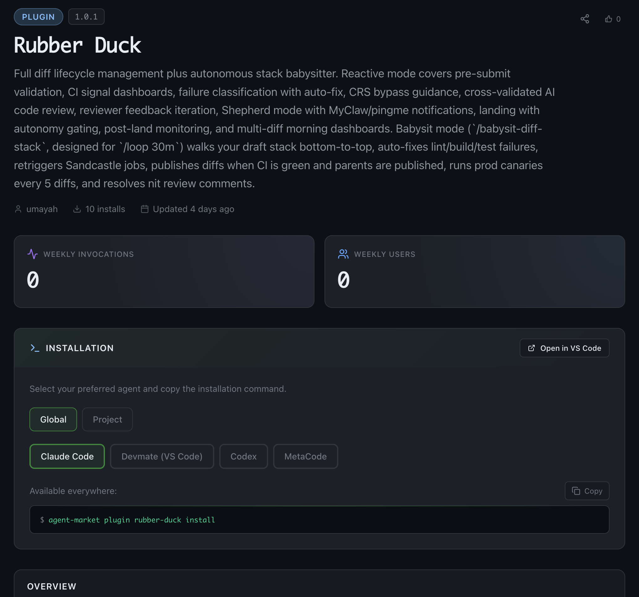
Rubber Duck published to the internal agent marketplace — full diff lifecycle management + autonomous stack babysitter, v1.0.1
Implementation & Launch
Phased Rollout: Alpha (Weeks 1–2): Designer's team only; rapid iteration on core workflows. Beta (Weeks 3–6): Opt-in community testing; 50+ engineers providing feedback. General Availability (Week 8): Published to internal plugin marketplace and chat skill platform.
Distribution Strategy: The tool shipped across three surfaces—CLI Plugin for terminal-native workflows, Chat Skill for conversational interaction, and IDE Extension for integrated editor experience. Each surface shared core logic but adapted interaction patterns to its context.
Impact & Adoption
Within six weeks of general availability: active installations across multiple organizations, positive reception from infrastructure and product engineering teams, and feature requests for integration with additional CI systems. Qualitative feedback highlighted reduced context-switching and overnight landing of approved changes as primary value drivers.
Evolution: The Server-Side Complement
Post-launch, a gap emerged: Rubber Duck required an active session. This insight spawned a complementary project: a server-side daemon that monitors approved changes 24/7, independent of any engineer's machine. The combined system—client-side tool for active development, server-side daemon for passive monitoring—created a complete diff lifecycle platform.
Lessons Learned
Hackathons surface latent demand. The enthusiastic response to a rough prototype validated market need faster than any roadmap process could have.
Autonomy requires trust scaffolding. The four-level autonomy framework let users build confidence gradually rather than forcing binary trust decisions.
Safety gates are features, not limitations. Hard boundaries on automation built trust precisely because they couldn't be overridden.
Same logic, different surfaces. Designing for CLI, IDE, and chat simultaneously forced disciplined separation of core logic from presentation—ultimately accelerating development.
Tools that understand context outperform tools that require it. Auto-detecting lifecycle phase eliminated an entire category of user input, reducing friction dramatically.
EGen Portal: Designing a GPU Compute Orchestration Experience
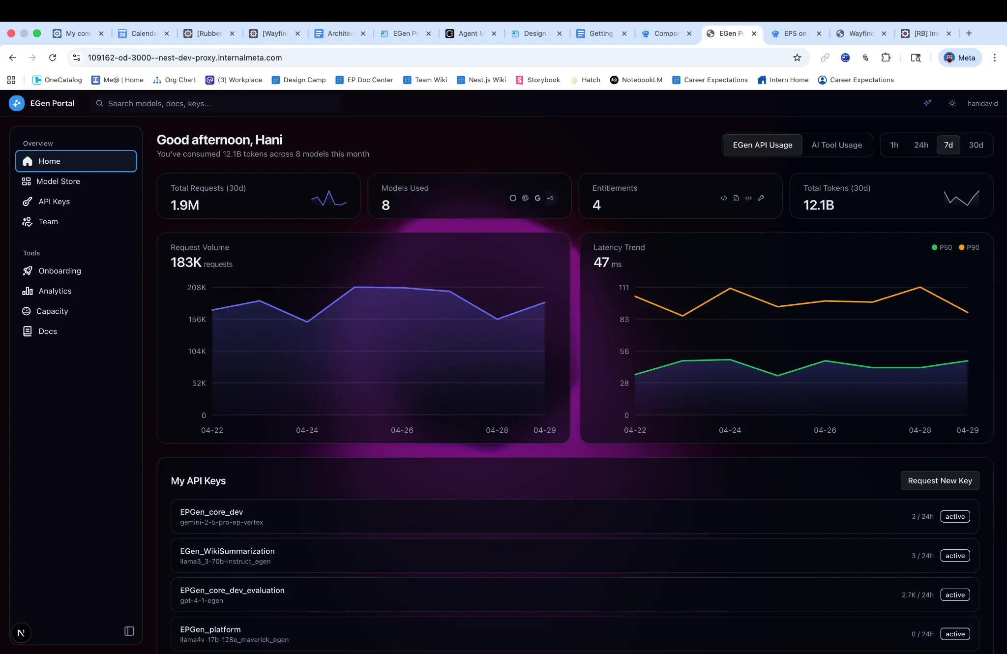
EGen Portal home — 1.9M total requests, 12.1B tokens consumed, real-time request volume and latency trends
Overview
At a major technology company operating at hyperscale, GPU compute resources represent one of the most constrained and strategically valuable assets. As AI and machine learning workloads proliferated across the organization, engineering teams faced a critical challenge: how to efficiently allocate, monitor, and optimize GPU capacity across dozens of product teams with competing priorities and unpredictable demand patterns.
The EGen Portal project addressed this challenge by creating a centralized orchestration platform that sits between teams requiring GPU compute and the physical infrastructure that provides it. As the Product Designer on this initiative—and one who contributes production-level code—the designer was responsible for shaping the end-to-end experience, from initial research through implementation and iteration.
The portal serves as the primary interface for engineers and technical program managers to understand their GPU allocations, monitor utilization in real-time, and take action to optimize efficiency. It transforms what was previously an opaque, ticket-driven process into a self-service experience with clear visibility and actionable guidance.
Challenge
Visibility gaps. Teams couldn't easily understand their current allocation, actual utilization, or how their usage compared to their entitlement. This made capacity planning nearly impossible and led to both over-provisioning (wasted resources) and under-provisioning (blocked launches).
Coordination complexity. The platform needed to route requests to appropriate models, enforce per-team rate limits, cache repeated requests, and manage relationships with multiple cloud providers. Without a unified interface, teams navigated this complexity through tribal knowledge and manual processes.
Demand volatility. Usage patterns varied dramatically based on business cycles—recruiting surges during hiring waves, spikes during quarterly performance reviews, burst activity around contract deadlines. The system needed to accommodate these patterns while preventing any single team from starving others of resources.
Scaling constraints. Teams seeking to move beyond prototype scale needed a structured process to bring additional capacity into the system, but the existing mechanisms were poorly documented and inconsistently applied.
User Research Findings
Engineers spent an average of 4+ hours per capacity request navigating internal documentation and communication channels
68% of interviewed users reported "low confidence" in their understanding of current GPU utilization
Teams frequently discovered capacity constraints only after failed deployments or degraded performance
The mental model of "bringing capacity" to the platform was poorly understood, leading to repeated support escalations
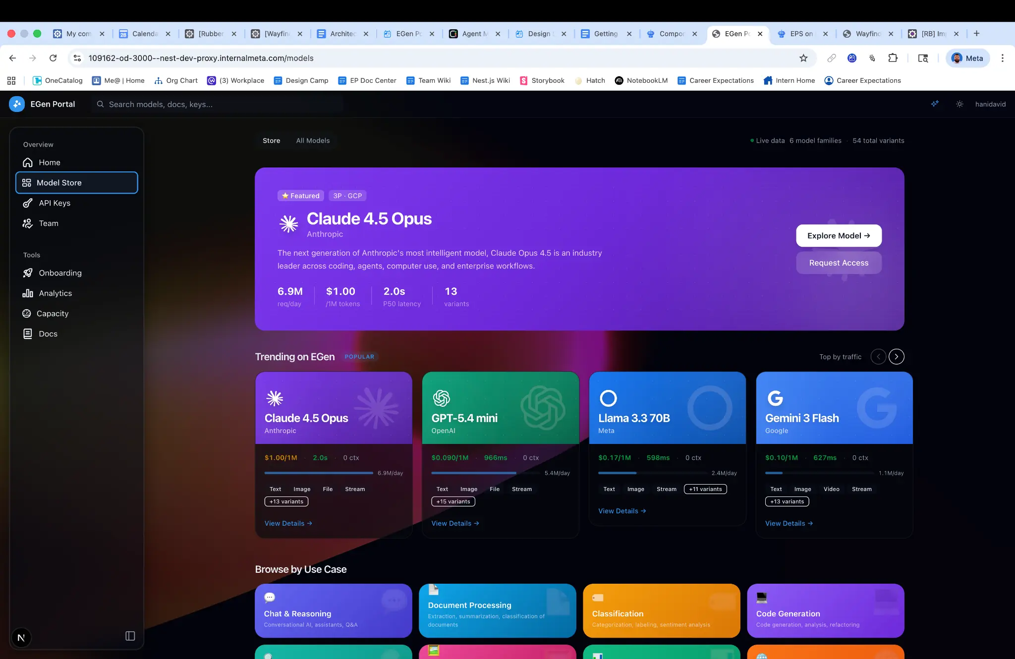
EGen Model Store — 54 model variants across 6 families, with live traffic data, latency benchmarks, and capability tags
Design Strategy
Design Principles Based on research findings, the designer established four core principles:
Transparency over abstraction. Rather than hiding system complexity, surface it in digestible ways that build user understanding over time.
Proactive over reactive. Shift from a model where users discover problems to one where the system anticipates needs and surfaces recommendations.
Self-service with guardrails. Enable autonomous action while preventing configurations that could destabilize the broader system.
Progressive disclosure. Serve both the engineer checking a quick metric and the TPM conducting quarterly capacity planning.
Information Architecture The portal was organized around three primary views:
Fleet Overview provided organization-level visibility into total capacity, current utilization, and allocation distribution across teams. This view served leadership and capacity planners who needed to understand the holistic picture.
Team Workspace gave individual product teams a dedicated environment showing their specific allocations, utilization trends, rate limit status, and efficiency scores. Interactive visualizations allowed users to drill from high-level metrics into granular request-level data.
Action Center consolidated all optimization opportunities—unused allocations that could be released, efficiency improvements that could free capacity, and pending requests requiring attention. Each recommendation included estimated impact and one-click implementation where appropriate.
Key Design Decisions
Efficiency scoring system. The designer developed a normalized scoring mechanism that helped teams understand their GPU efficiency relative to benchmarks. This avoided the pitfall of displaying raw metrics that users couldn't contextualize, instead providing clear indicators of whether attention was needed.
Allocation visualization. A custom visualization was designed to represent the relationship between entitlement, allocation, and actual utilization—three concepts that research showed were frequently conflated. The design used spatial metaphor (containers within containers) to build intuitive understanding.
Guided workflows. For complex processes like requesting additional capacity or configuring rate limits, the designer created step-by-step flows that validated inputs, explained implications, and surfaced relevant documentation contextually rather than requiring users to leave the application.
Technical Implementation
A distinguishing aspect of this project was the designer's direct involvement in production implementation. This hybrid role enabled rapid prototyping in production (building functional prototypes using the actual component library and data APIs), design system contributions (custom charts, capacity allocation bars, and status indicators built as reusable components), performance-conscious design (informed tradeoffs between visual richness and rendering performance), and API collaboration (influencing API response structures to better support frontend needs).
The frontend was built using React with a typed data layer, ensuring that the interfaces between design and data remained stable as the platform evolved.
Collaboration
The project required coordination across multiple stakeholder groups: infrastructure engineering (underlying orchestration systems and APIs), capacity planning stakeholders (aggregate views and export capabilities for quarterly planning), product teams (iterative usability testing shaping progressive disclosure patterns), and security and compliance (access control patterns and team-level data isolation). Weekly design reviews and a dedicated Slack channel maintained alignment, while a shared Figma workspace provided visibility into design evolution.
Impact
75% reduction in time spent on capacity-related support requests
Self-service adoption reached 89% for routine allocation adjustments within three months
Utilization visibility improved from 32% of teams having real-time access to 100%
Capacity planning cycle time decreased by approximately 40% due to improved data accessibility
Qualitative feedback highlighted the shift from "operating in the dark" to "finally understanding what we have and how we're using it." The efficiency scoring system proved particularly valuable, with multiple teams citing it as the catalyst for optimization initiatives they had previously deprioritized.
Lessons Learned
Infrastructure products demand domain immersion. Designing for GPU orchestration required significant investment in understanding the underlying systems—how allocation hierarchies work, what rate limiting means in practice, how caching affects capacity planning. This domain knowledge directly informed design decisions that would have otherwise missed the mark.
Internal tools deserve external-quality craft. Despite being an internal platform, treating the experience with the same rigor as a consumer product drove adoption and satisfaction. Engineers notice and appreciate thoughtful interaction design, even in utilitarian contexts.
Code fluency accelerates everything. The ability to implement designs directly collapsed feedback loops, enabled more informed conversations with engineering partners, and resulted in a higher-fidelity outcome than would have been possible through handoff-based workflows.
Visibility creates accountability. Simply making utilization data accessible changed team behavior. The design lesson: sometimes the most impactful intervention is surfacing information that was previously obscured, not adding new capabilities.
VP-level visibility — the portal reached leadership within days of launch
This project exemplifies how thoughtful product design, combined with deep technical engagement, can transform complex infrastructure into an accessible, empowering experience for engineering teams.